Interior architects describe how a wooden house in a hopeless state was turned into the most lively place in the summer capital called the Miami Lounge
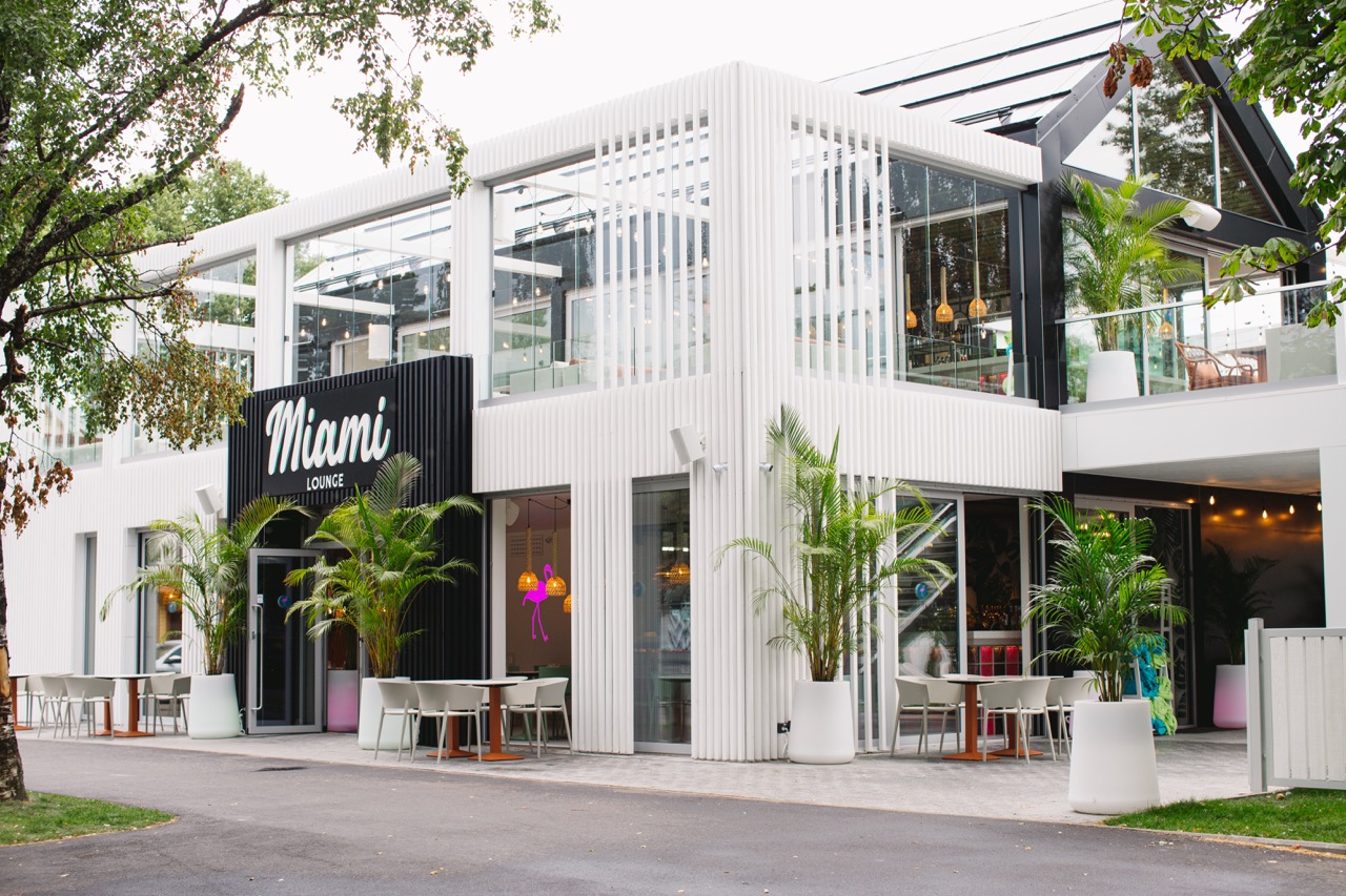
This year, Pärnu’s summer festivities got an addition in the form of a very unique place – the hot and sizzling Miami Lounge was built in the summer capital. A3 interior architecture office, led by Aet Seire and Hillar Mänd, was responsible for the colorful interior design, according to whose concept OCCO furnished the venue. The interior architects describe in the interview how the distinctive concept was completed and what inspired them.
What guided you when you started the project?
Hillar: I already knew this building: a dingy department store built in the 1950s on the proud main street of Pärnu, which served as a restaurant in the 1990s. The client was targeting several properties on this street, but at first glance it seemed least painful and profitable to acquire this building. The idea was there from the start and so was the name – Miami Lounge. As an interior architect, the first desire is always to create a layout that works as well as possible, and that’s what we did with Aet.
However, then we discovered that the house had been built with the materials at hand at the time and it was completely out of order – the beams had rotted, etc. A new building had to be built in its place, and Tanel Tuhal, a well-known architect in Pärnu, was involved along with his office. To our delight, the initial plan remained in place. Our plan became the initial task and basis for the architect, which has usually been the other way around in the design process.

What were the customer’s wishes?
Hillar: The client’s wish was to create a modern place, something that stands out – something completely new. The inspiration came from Miami, America, which has many different rooftop bars.
Of course, the client’s wish was for an insane amount of seats, and the whole structure had to be very rational both in terms of budget and space. In order for the kitchen to be able to serve the masses, it had to be quite large. It was also the biggest challenge – to squeeze all the necessary space to such a small lot.
Since one of the most important elements in design is the people themselves, our task was to create a background system for them. We used a lot of plastic in the materials so that the material could withstand the masses. Partly also so that the servers, mainly young women, could move the furniture if necessary. Furnishings and interior had to be both moisture and cold resistant. So that if you turn off the heating in winter, nothing will go wrong. We couldn’t use fancy textiles and carpets – the idea was that in the summer when a person comes in wearing a bikini they can sprinkle beach sand on the floor.

Aet: The client’s idea was to create a fast, non-stop eating and drinking spot where a carefree summer vacationer could spend a cheerful morning, day, evening and night with friends and loved ones. There should be constant fun – bright inviting colors and large masses moving. From there came the idea of using strong colors such as turquoise blue, pink and neon tones. We took the old Georgian columned buildings as a base and tried to capture and recreate the old Miami bar scene. We wanted to convey the real hustle and bustle and eclecticism of nightlife. It’s true that the old house from the 50s would have been suitable for this idea, but it was in such a bad condition that it had to be rebuilt.
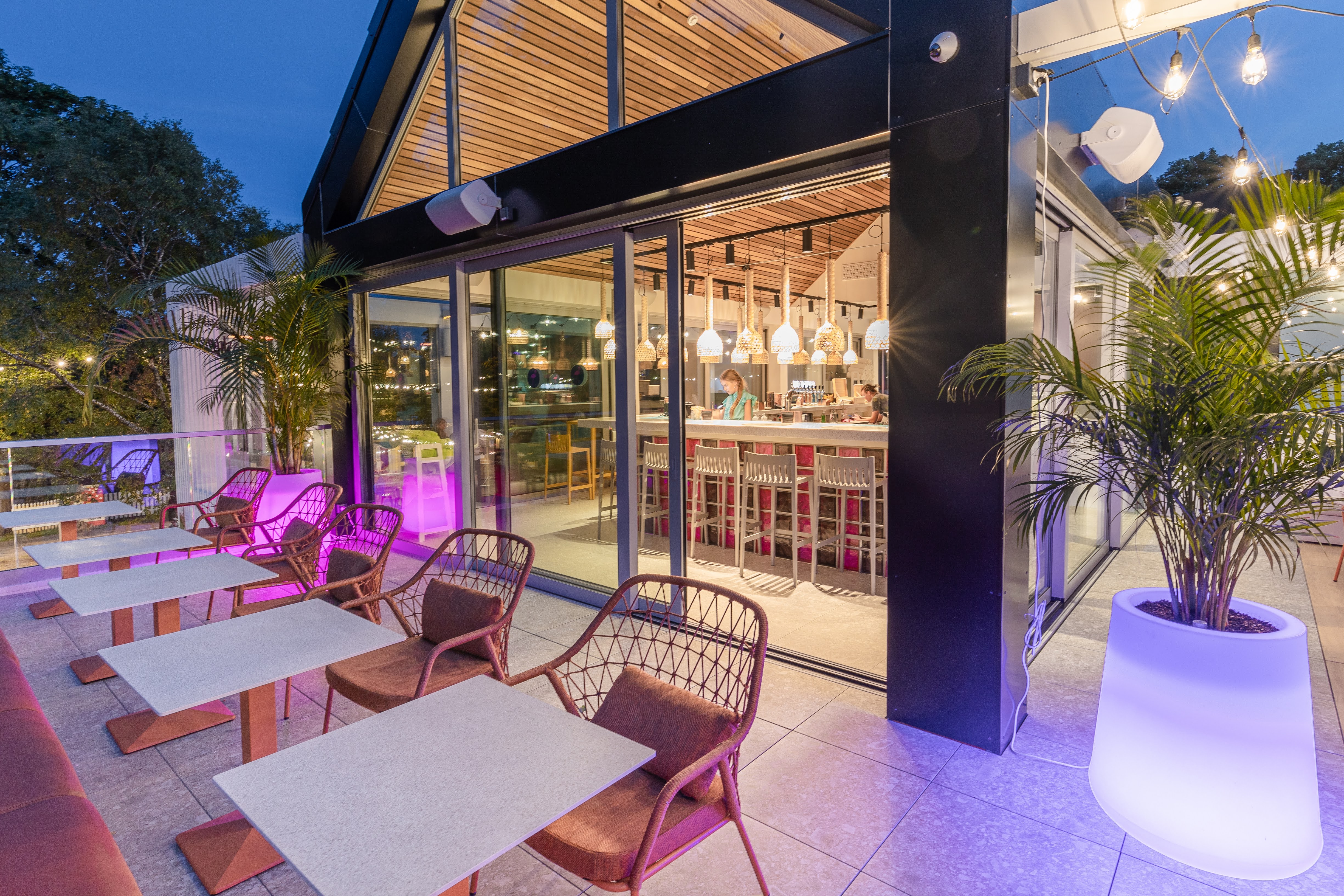
Hillar: Since there was a desire to create a terrace on the second floor, roof layers and insulation were added, which could not have been done with the structure of the old building. All in all, it would have meant building a city around one house. Therefore, the client had to accept the decision with a heavy heart to demolish the building and build a new one.
Aet: The cooperation with the architect was very nice and smooth, and the result is excellent!
Hillar: The client made a very big investment also considering that the place is only open for three months – only during the summer season. If you look at it in general, it seems that not so much money has been invested here and it could be even more. But if you look at the period when the place is open, a very big investment has been made. The whole concept is very interesting in that sense.
What are your favorite elements of this project?
Hillar: One of my favorites is the luminous outdoor furniture, which I haven’t used anywhere before. When the object was finished, I thought that this element could have been emphasized even more. The luminous furniture had a very intense effect especially in the twilight, when the day starts to turn into night. Unfortunately, it was quite expensive compared to the rest of the furniture, and therefore could not be used more.
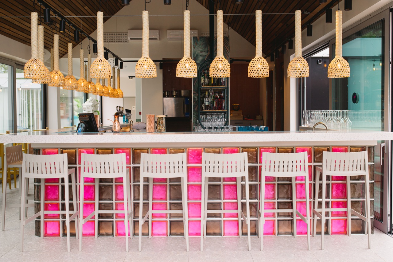
Aet: My favorite is the striped glass block counter – a very massive and repetitive element, placed in an organized way in the middle of the room on both the first and second floor, it summarizes the space well. In addition, the concept of colored light, with luminous furniture.
Hillar: This counter was set right from the start when the architect joined us. The counter had to be visible from the street when a person passed by – it had to be inviting. In the old wooden house, the second floor was completely unused, our goal was to get the visitor to the second floor as well. Luminous counters work a bit like a beacon and attract people. Since the entire building is made of glass, the counters also stand out.

How does Miami-like glitz differ from your own style?
Aet: The thing about design is that you are, in other words, an actor and you adapt to the client and the task or challenge presented by them. The beauty and pain of the whole process lies in how skillfully you remain yourself as much as possible, meanwhile doing what pleases you and ultimately the client. The client of this project is already familiar with us – we have done several jobs in the past, so we believe that he recognized and knew our handwriting. We also have our own inside jokes with the client like: “We won’t do the 70s this time!” – so as a remark, we have to admit that we really like this era. But with this project we did the 90s instead!
Hillar: A client recently asked me if designers have their own style in Estonia? Estonia is so small that you are forced to do a little bit of everything. The thing about an entertainment venue is that you’re kind of setting the stage. The main idea must inspire you which can also make your life interesting.
Of course, you could make all the places the same, based on your own style. However, it is much more exciting if you can take the specifics of the place as a basis and give the the project your own style of fun look and story. The main inspiration for this project was the summer in Pärnu – it can’t be found anywhere else but in Pärnu. Sultry climate and non-stop fun – this was supposed to describe the Miami Lounge.
Our news
See all news
January 16, 2023
What makes start-up offices so special that employees enjoy spending time there even after the end of the working day?
January 9, 2023
kood/Jõhvi coding school co-director Karin Künnapas: anyone can write code with enough motivation and interest
December 20, 2022
Office from the future: The new space for Ogre looks like an office from the 2030s
December 20, 2022
Fujitsu Property and Workplace Standards Manager Olly Dickinson: The Tallinn office is the most exciting project of the last seven years!
December 7, 2022
Sauna, massage chair and a library: the brand new office of Skeleton Technologies makes you want to live there
October 24, 2022